
Colour is the most immediate and emotionally impactful design decision for outdoor furniture. It sets the mood before a guest sits down, defines the Instagram aesthetic of your venue, and either harmonises with or fights against your architecture and landscape. For B2B buyers, colour choices also have practical implications — heat absorption, stain visibility, and fade resistance all vary significantly by colour.
Palette 1: Warm Earth & Clay (Dominant Trend)The most significant colour movement for 2026-2027 is the shift toward warm, grounded earth tones. This palette connects outdoor furniture to its natural surroundings:
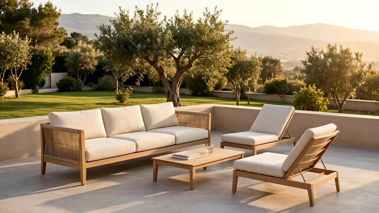
- Terracotta & Burnt Sienna: Mediterranean warmth; pairs beautifully with olive trees and stone architecture.
- Sand & Limestone: Neutral foundations that let architecture and landscape take centre stage.
- Warm Greige: The bridge between cool modernism and warm traditionalism — versatile and timeless.
These colours are available across our full product range through custom powder-coating.
Palette 2: Deep Nature GreensMoving beyond the sage greens of recent years, 2026-2027 sees richer, deeper greens:
- Forest & Pine: Dark, dramatic greens that create cocooning outdoor rooms.
- Olive: A perennial favourite that works across styles from rustic to contemporary.
- Bronze-Green: A sophisticated metallic-tinged green for luxury settings.
Blue's association with sky and water makes it a natural choice for outdoor spaces. The trend is toward deeper, more saturated blues:
- Ink Blue / Midnight: Dramatic and luxurious; excellent for evening-focused venues.
- Cerulean: Bright, Mediterranean blue for poolside and coastal properties.
- Dusty Blue: A softer, more approachable blue for relaxed settings.
A counter-trend to earth tones: hotels and restaurant groups increasingly use outdoor furniture colour as brand expression. Custom powder-coating in any RAL colour allows exact matching to brand guidelines. We have produced furniture in custom yellows, corals, and deep burgundies for brand-conscious hospitality clients.
Practical Colour Selection Tips- Dark frames absorb heat: A black aluminium frame in direct Mediterranean sun can reach 70°C+. Lighter colours stay significantly cooler.
- Light fabrics show stains: While light cushions look fresh and airy, they reveal every coffee spill. Patterned or mid-tone fabrics are more practical for high-turnover venues.
- Colour consistency: When ordering in phases (e.g., hotel expansion), request colour swatch retention to ensure batch-to-batch consistency.
- Test in situ: Colours look dramatically different in natural sunlight vs. showroom lighting. Always request physical samples and view them on your actual site.
Need colour consultation for your project? Contact our design team for colour samples and custom matching.